Royal Tasmanian Botanical Gardens: Brand identity development
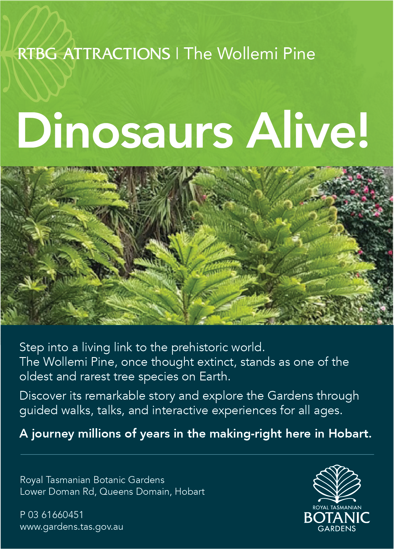
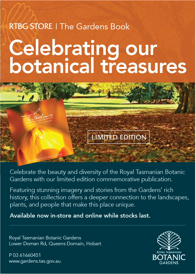
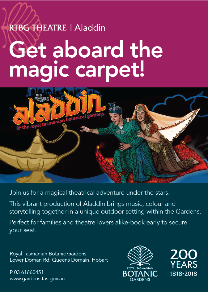
A flexible identity system was developed to unify the Gardens’ diverse offering across exhibitions, retail and events.
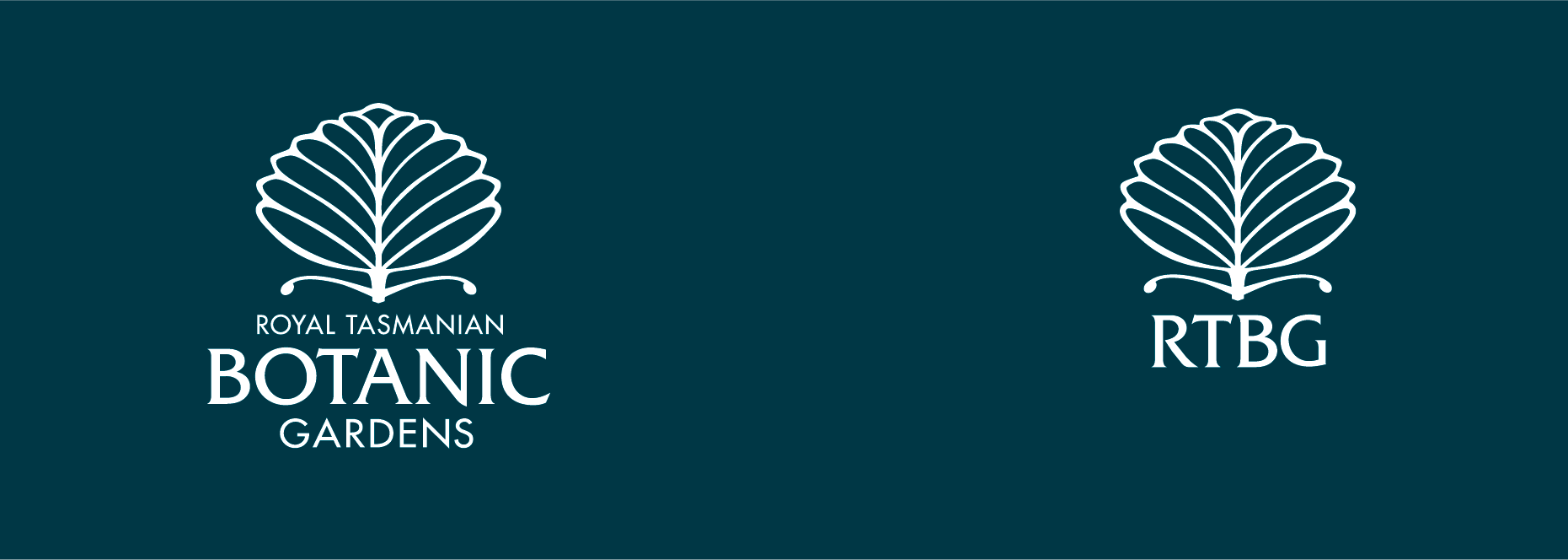
The approach combines a clear typographic hierarchy with a modular layout, allowing content to shift across formats while maintaining consistency. The logo mark references the form of the Fagus, Tasmania’s only winter-deciduous tree, grounding the identity in place and history.
A refined serif palette nods to the Gardens’ Victorian era origins, balanced with a contemporary layout system for clarity and relevance.
Colour is used to differentiate campaigns while maintaining a cohesive visual language, creating a system that balances accessibility with a sense of discovery.
My role: design and art direction