

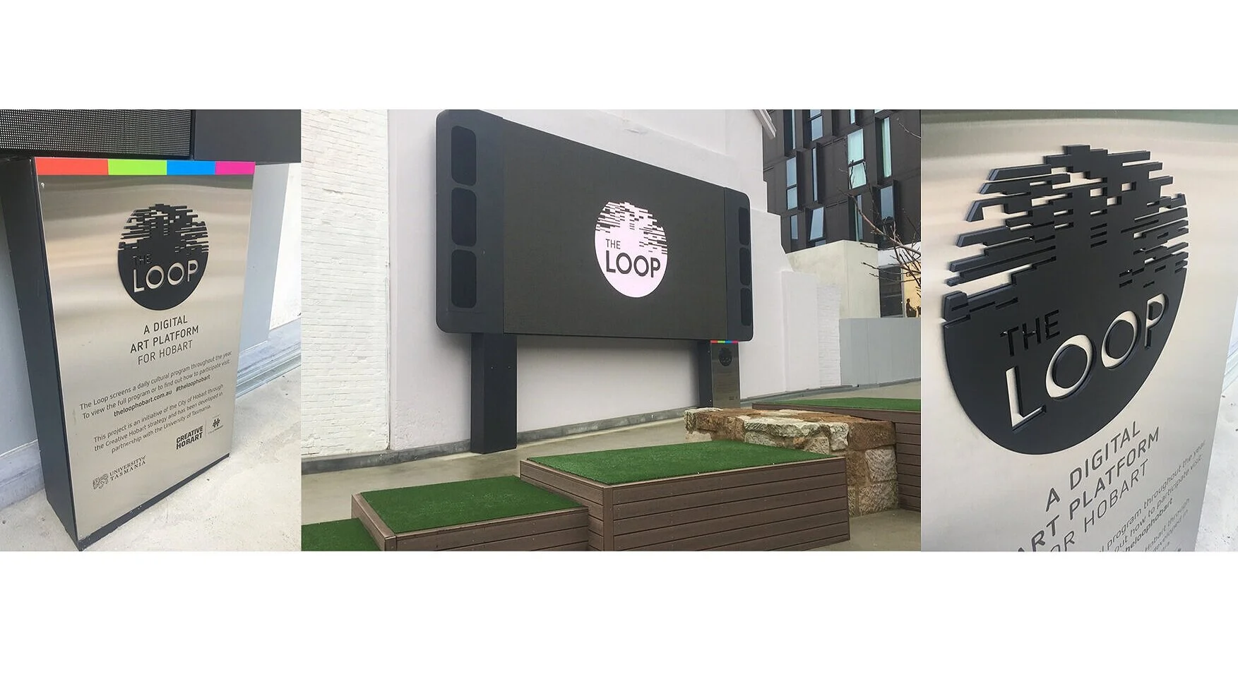
City of Hobart: The LOOP public digital screen
This identity is anchored in a simple circular form, referencing the idea of a loop and the continuous cycle of digital programming. Within that, I introduced fragmented horizontal elements inspired by digital signal behaviour - suggesting motion, disruption, and the nature of screen-based media.
The typography was deliberately restrained and highly legible, designed to balance the more expressive graphic element and work effectively in an open public setting.
My role: identity design, all design and production
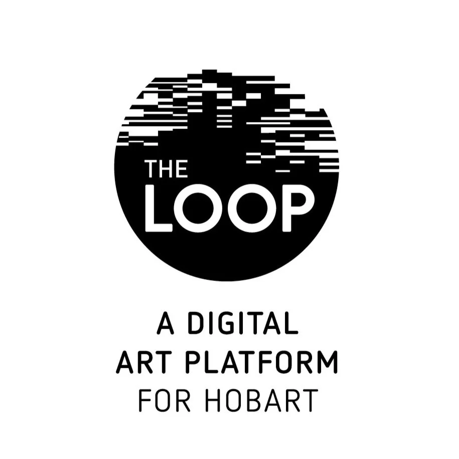
Logo development