Glendale Olives: brand development
The identity is grounded in a hand-produced woodcut, forming the basis of a tactile and authentic visual language. This analogue origin informs both the logo and supporting graphics, reinforcing the product’s connection to craft, place and process.
The broader system applies this language across packaging and collateral, using restrained typography and natural colour palettes to maintain clarity and cohesion. The result is a considered identity that balances heritage with contemporary application.
This branding execution was a finalist in the Dieman Awards, in the category of Design/Illustration - hand produced image with or without the aid of technology. The logo was developed from a woodcut that was carved and printed and then fine-tuned in
Adobe Illustrator.
My role: design and art direction
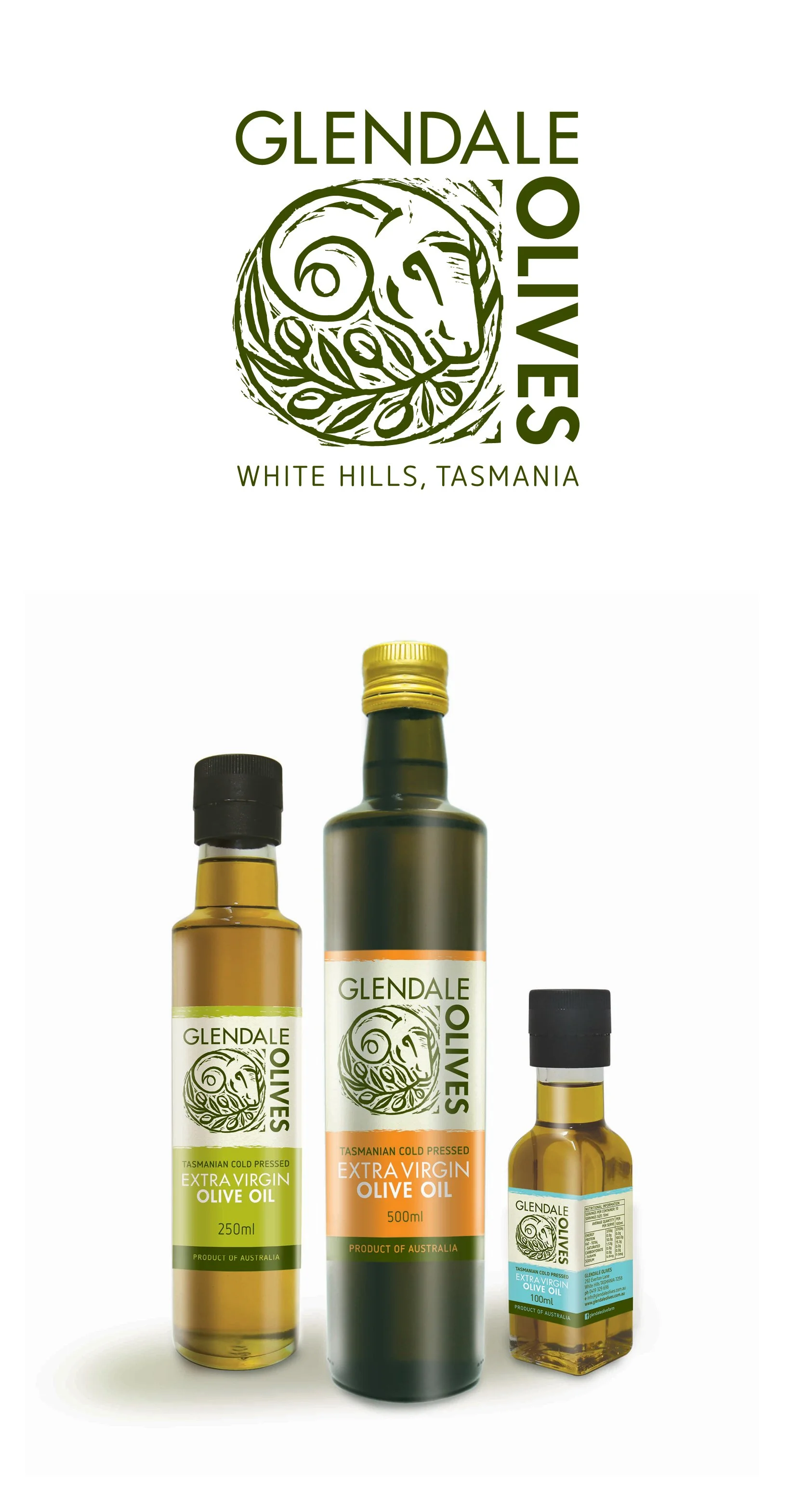
Labels
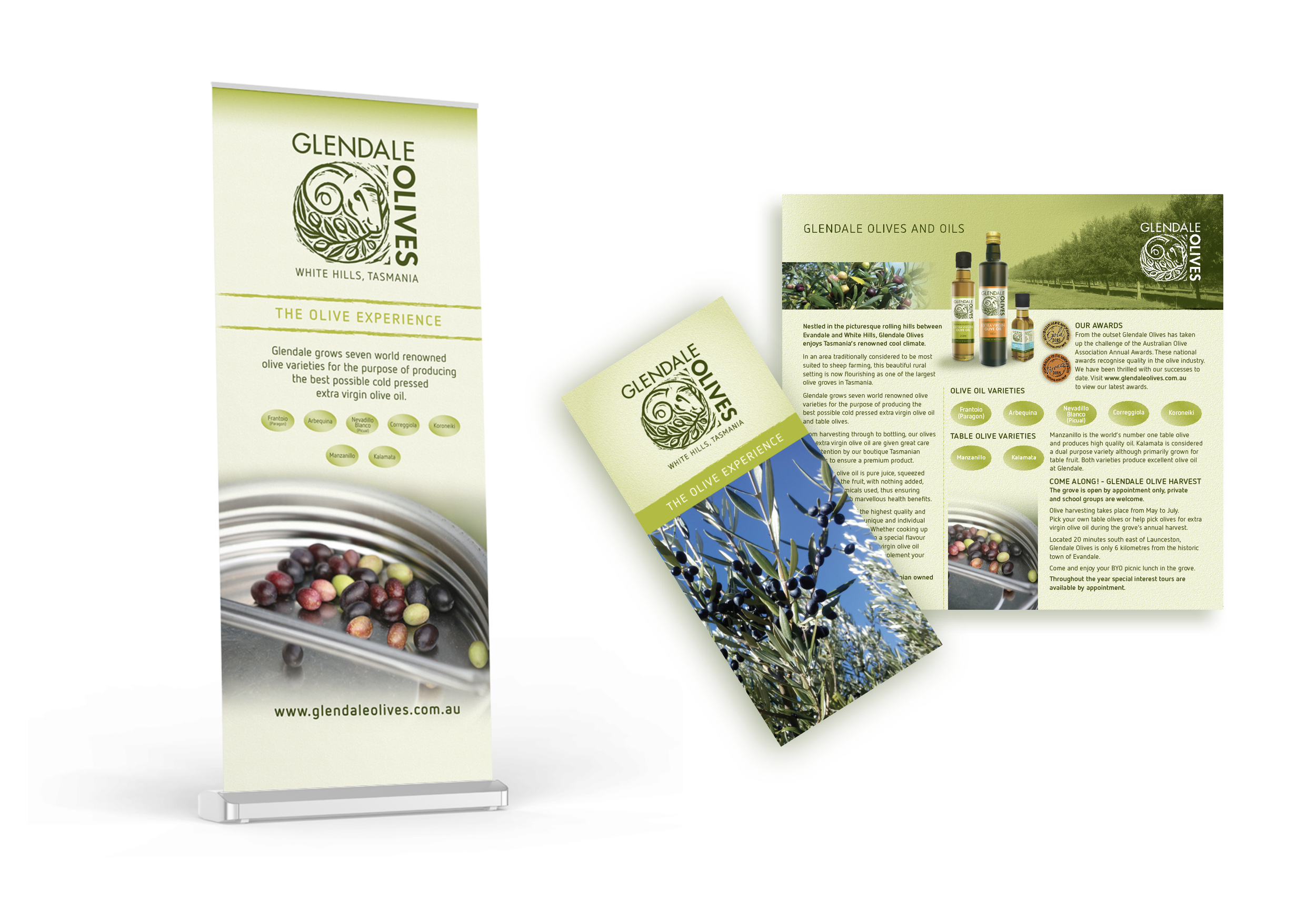
Pull-up banners
Brochures